library(tidyverse)
library(ggalt)
library(sysfonts)
library(showtext)

atp <- read_csv("ATP_Rankings_1990-2019.csv")

font_add_google("Merriweather Sans", regular.wt = 400, family = "merri")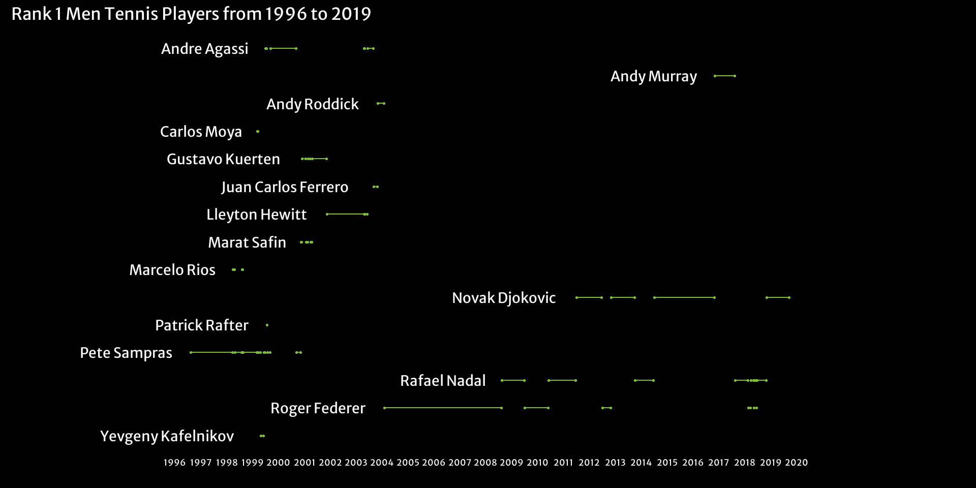
showtext_auto(enable = TRUE)Hi, this time I tried to analyse some Tennis data. I obtained a dataset of ATP points, and turned it into a dataset of Rank 1 players and the dates they were Rank 1.
Now let’s process the data to obtain what we want.
rank_1 <- atp %>%
  filter(Points > 0) %>%
  mutate(Date = lubridate::as_date(Date))  %>%
  group_by(Date) %>%
  slice_max(Points) %>%
  arrange(Date) %>%
  ungroup() %>%
    mutate(Rank1_Change = Player != lag(Player, default = first(Player))) %>%
    group_by(Player) %>%
    mutate(Group = cumsum(Rank1_Change)) %>%
    group_by(Player, Group) %>%
    summarize(
      First_Day = min(Date),
      Last_Day = max(Date)
    ) %>%
    ungroup() %>%
    select(-Group)

rank_1
# A tibble: 44 × 3
Player First_Day Last_Day
<chr> <date> <date>
1 Andre Agassi 1999-07-05 1999-07-19
2 Andre Agassi 1999-09-13 2000-09-04
3 Andre Agassi 2003-04-28 2003-05-05
4 Andre Agassi 2003-06-16 2003-09-01
5 Andy Murray 2016-11-07 2017-08-14
6 Andy Roddick 2003-11-03 2004-01-26
7 Carlos Moya 1999-03-15 1999-03-22
8 Gustavo Kuerten 2000-12-04 2001-01-22
9 Gustavo Kuerten 2001-02-26 2001-03-26
10 Gustavo Kuerten 2001-04-23 2001-11-12
# ℹ 34 more rowsThese two objects will help with the plot.
players <- rank_1 %>%
  select(Player) %>%
  arrange(desc(Player)) %>%
  unique() %>%
  as.vector() %>%
  unlist()

names <- rank_1 %>%
  group_by(Player) %>%
  slice_min(First_Day)
Now, we make our plot, using a Dumbell chart!
rank_1 %>%
  ggplot() +
    geom_dumbbell(aes(x = First_Day, xend = Last_Day, y = factor(Player, players)), size = 0.5,
                  colour_x = "#7bc133", colour_xend = "#7bc133", fill = "#7bc133", colour = "#7bc133") +
    geom_text(data = names,
              aes(x = First_Day, y = factor(Player, players), label = factor(Player, players), hjust = 1.2),
              family = "merri", colour = "white", size = 7.5) +
    scale_x_date(expand = c(0.3,0), breaks = seq(as.Date("1996-01-01"), as.Date("2020-01-01"), by = "year"),
                 date_labels = "%Y") +
    theme_minimal() +
    theme(axis.text.y = element_blank(),
          axis.title.y = element_blank(),
          panel.grid = element_blank(),
          axis.title.x = element_blank(),
          axis.text.x = element_text(family = "merri", colour = "white", size = 13),
          plot.background = element_rect(fill = "black", colour = "black"),
          plot.title = element_text(family = "merri", colour = "white", size = 25)) +
    labs(
      title = "Rank 1 Men Tennis Players from 1996 to 2019",
      caption = "Source: Kaggle and ATP Tour"
    )